How to choose exterior house colours
Choosing exterior colours for a repaint, renovation or new build: what to decide first, ten finished schemes on one house, and how to test before you paint.
Choosing an exterior colour usually starts with a handful of paint chips, each about the size of a stamp, and the job of picturing one of them across an entire house. It is a hard thing to picture. A white that looks soft in the shop can turn yellow in afternoon sun. A grey can read blue once the roof is beside it. A colour that seemed bold on the chip can look flat across a big wall.
That gap between the chip and the finished house is where most colour regrets come from, and a repaint is a slow and costly way to find out. This guide walks through the decision in a sensible order, from what you are working with to a shortlist you can test, and shows how much a house changes when only its colours do.
Start with the kind of job it is
How much freedom you have depends on what is changing, and that is different for every project.
A repaint. The roof, the windows, any brick or stone, the paving and often the garage door are all staying. The new colours have to get on with every one of them, so they are your starting point, and the real choice is the walls, the trims and the front door.
A renovation. Some of those fixed parts are up for change. If a new roof, new windows or new cladding is part of the job, choose their colours together with the paint rather than one after the other. Roof and window colours are often locked in when they are ordered, well before anyone talks about paint.
A new build. Nothing is fixed, which sounds easier and usually is not. With every surface open, choose one thing you already love, whether that is a stone, a timber, a roof colour or a photo of a house you keep coming back to, and build the rest around it.
Whichever it is, write down what is staying and what is changing before you look at a single colour. That short list narrows the choice more than any fan deck.
Decide the feel before the colour
Before choosing colours, decide what you want the house to feel like from the street. Most schemes fall into one of a few families:
- Light and calm. Soft whites and pale greys, so the house reads as one quiet shape.
- Warm and natural. Creams, sands and earthy tones that sit easily with timber and stone.
- Crisp contrast. Pale walls with a dark roof, frames or trims, so the lines of the house stand out.
- Dark and bold. Charcoal, navy or deep green walls, with lighter details set against them.
Pictures help more than words here. Save photos of houses you like, ideally ones similar in shape to yours, and look at what they have in common. Most people find they are drawn to one family far more than the others, and that alone cuts the fan deck down to a page or two.
Look at what the house already has
Every material has an undertone: a lean towards warm (yellow, pink, orange) or towards cool (grey, blue, green). Brick, stone, timber, the roof and even the paving all carry one, and a new colour either shares it or works against it.
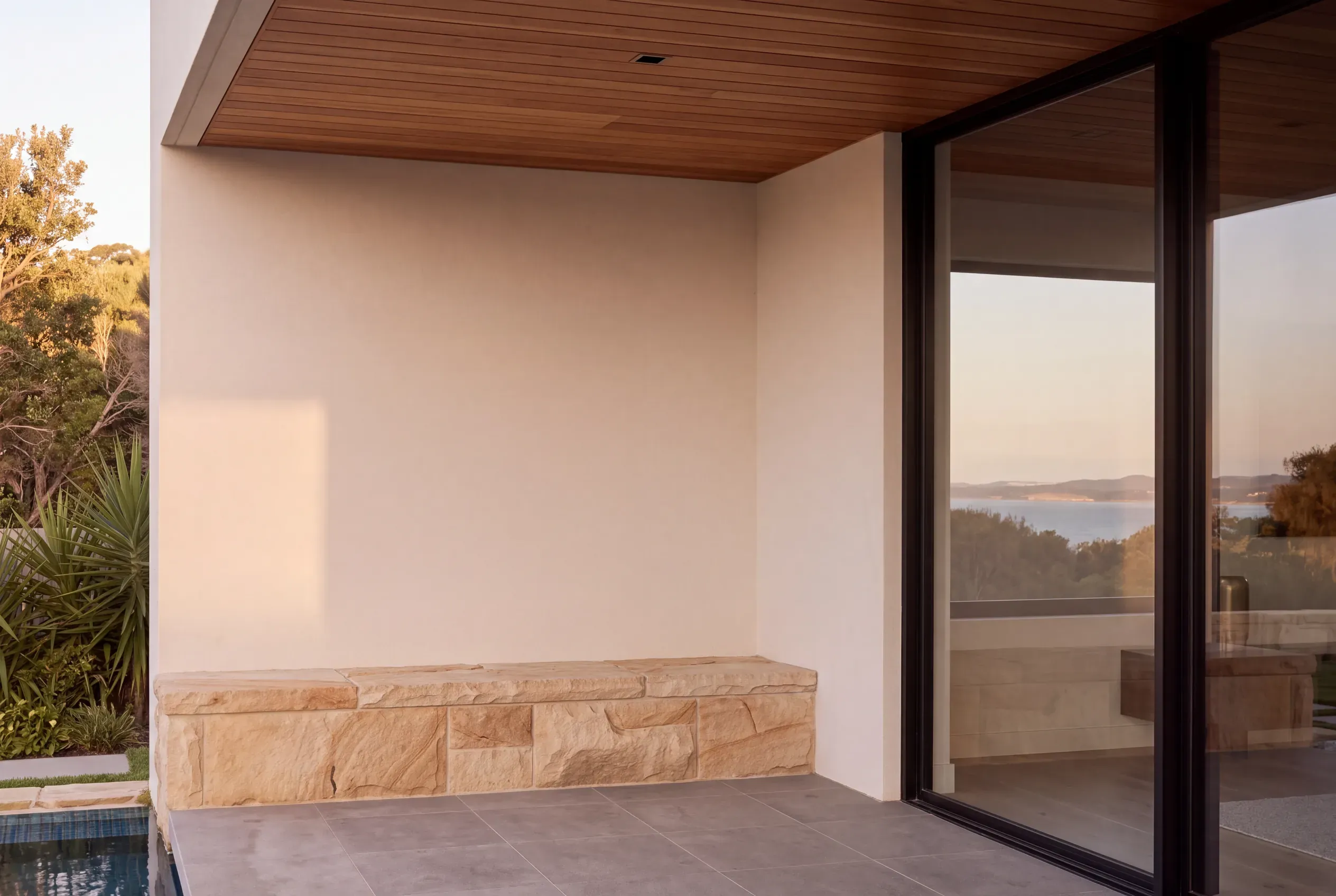
The easiest way to see it is to hold a sheet of plain white paper against the surface. Next to the paper, sandstone tends to look yellow, red brick pink or orange, and a grey roof slightly blue. Dulux’s advice follows the same logic: timber, clay and terracotta suit warmer colours, while concrete greys and blues suit cooler ones.
This does not mean everything has to match. It means knowing which way the fixed parts pull, so a warm white can be chosen to sit comfortably beside sandstone, or a cooler white can be chosen on purpose to make the stone stand out.
Give each colour a job
Most good schemes use three colours, and each one has a clear role:
- The main colour covers most of the walls. It sets the character of the house, and it is the colour people will describe it by.
- The trim colour goes on fascias, gutters, window surrounds, posts and balustrades. It can blend with the main colour for a soft finish, or contrast with it to outline the house.
- The accent is used sparingly, on a front door, a single wall or a screen. It is where a stronger colour can go without taking over.
Then there is the roof. Seen from the street, it is often the largest single area of colour on the house, and there are two ways to pair it with the walls.
Tonal. Roof and walls from the same family, a step or two apart, so the house reads as one shape. A pale roof also takes in the least heat: Colorbond’s dark charcoal Monument absorbs more than twice the sun’s energy of its off-white Surfmist.
Contrast. Pale walls under a dark roof, or the reverse. The roof becomes part of the design, and the edges of the house become sharper.
The window frames often settle it. Black frames tie in naturally with a dark roof, while under a pale roof they become a feature of their own.
One house, ten schemes
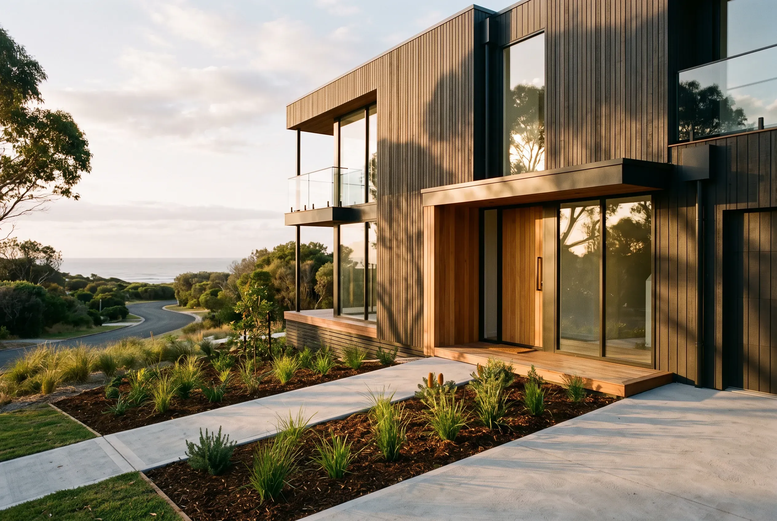
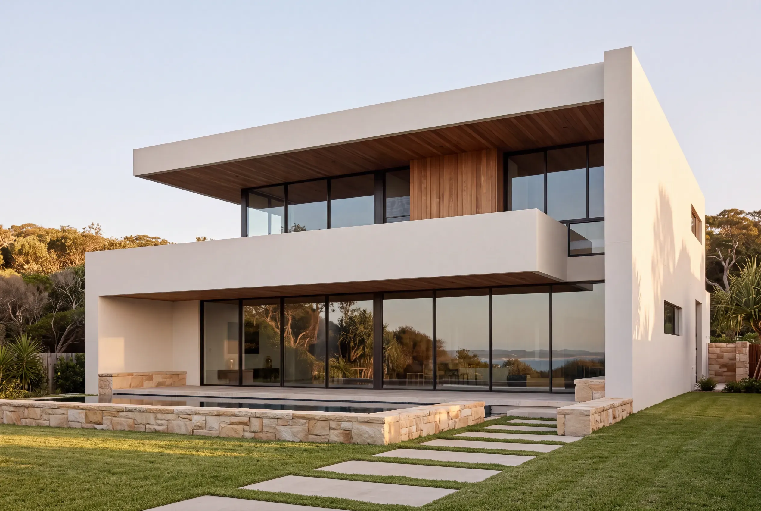
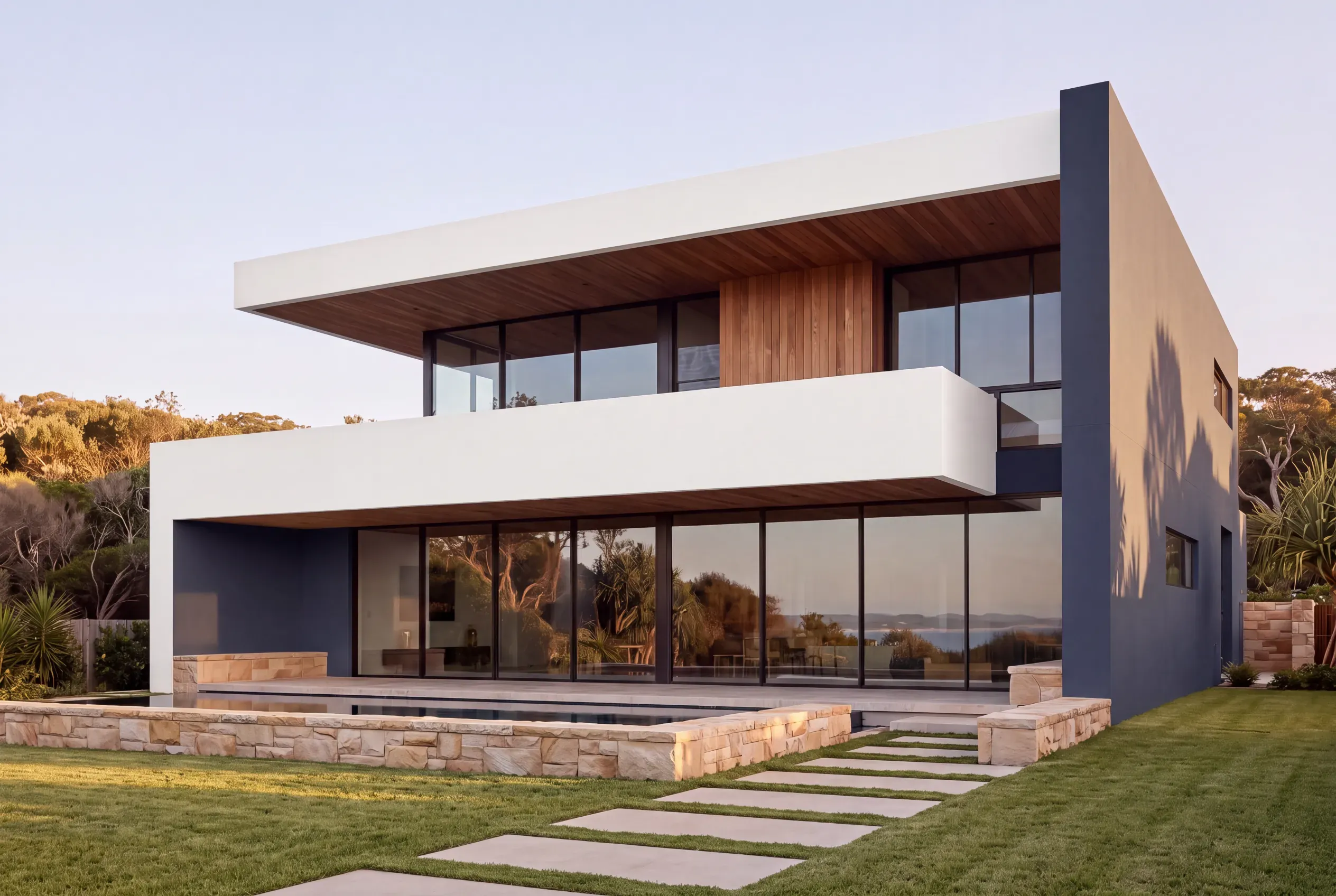
Every picture of the house in this guide shows the same home. We created the images and changed only the colours each time, so the difference you see is the colour and nothing else. Each scheme comes from a paint maker, a roofing maker or a design forecast, so every colour named below is real and can be taken to a painter as it stands.
They run from light to dark.
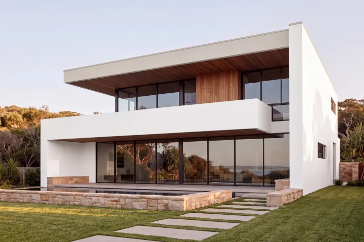
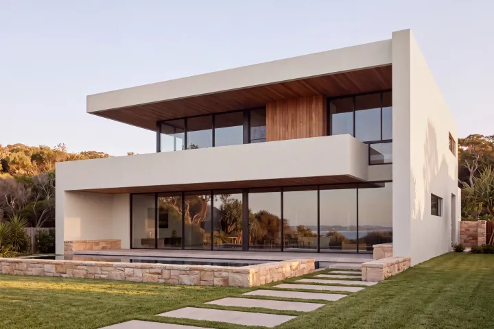
Crisp white
The brightest white, with the roof line softened in a warm greige.
- Walls Dulux Vivid White
- Trim Dulux Feather Soft
Dulux, An earthy oasis with Shale Grey
Soft white
One off-white everywhere. Calm, and hard to get wrong.
- Walls Colorbond Surfmist
Colorbond, from a Coral Homes house
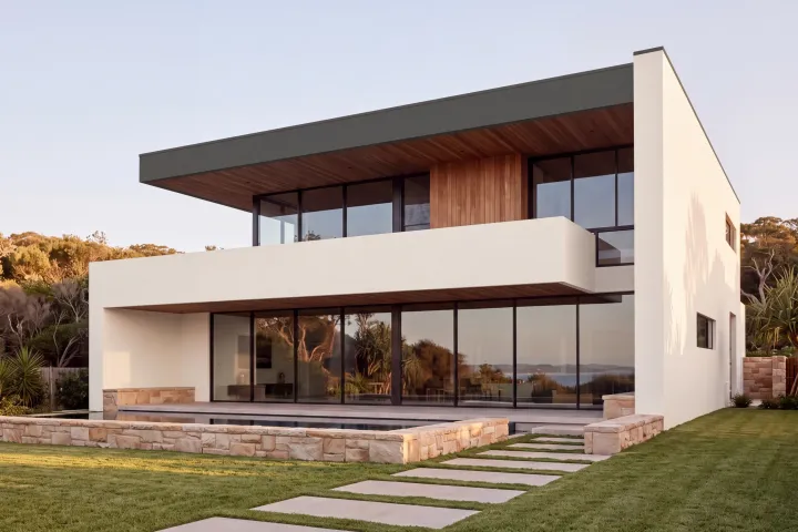
White with a dark edge
Warm white walls with the roof line drawn in deep grey.
- Walls Dulux Berkshire White
- Trim Colorbond Woodland Grey
James Hardie 2026 forecast, Box Modern
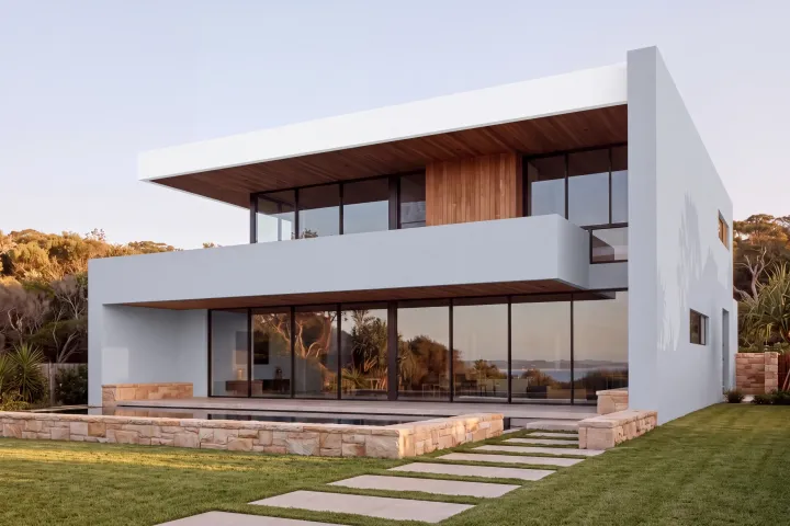
Pale grey and white
A cool, light grey with crisp white edges. Fresh without going stark.
- Walls Dulux Miller Mood
- Trim Dulux Lexicon Half
Dulux Hamptons exterior scheme
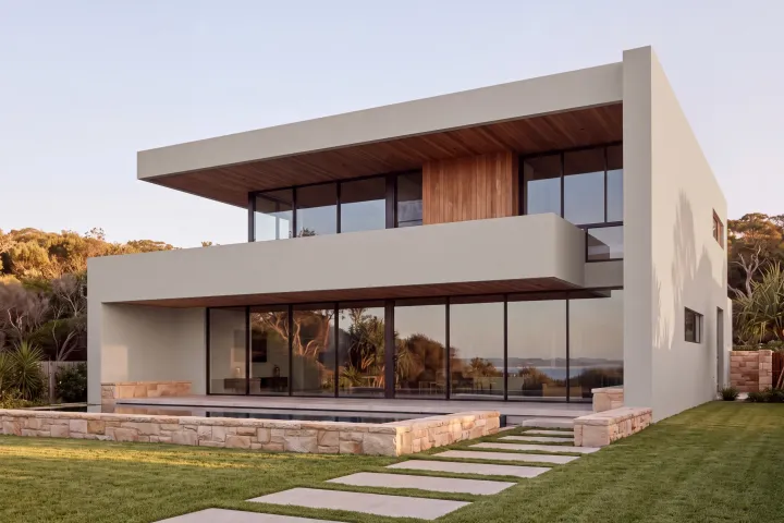
Warm grey
A soft grey with a beige lean that stays warm beside the stone.
- Walls Colorbond Dune
James Hardie 2026 forecast, Modern Farmhouse
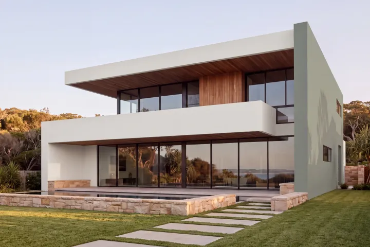
Moss feature wall
A light house with one wall in moss green, so the colour stays a feature.
- Walls Colorbond Surfmist
- Feature Dulux Misty Moss
James Hardie 2026 forecast, Box Modern
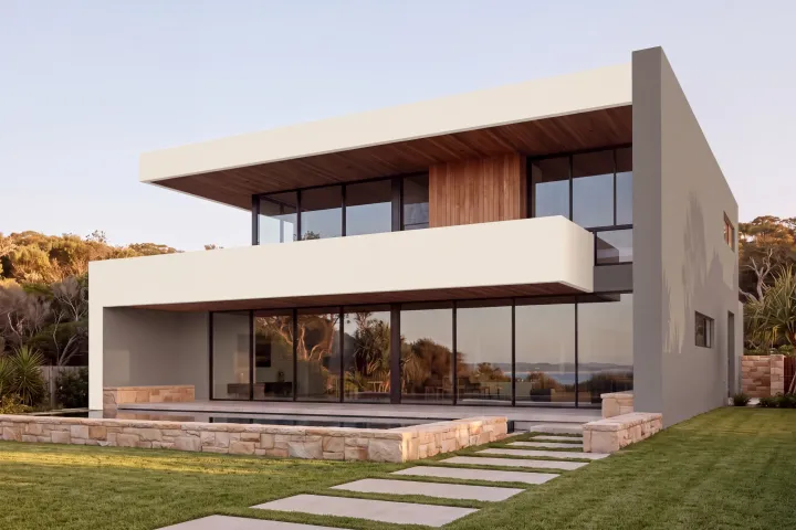
Warm grey and cream
Two warm grey walls frame creamy white bands, soft against the sandstone.
- Walls Dulux Reckless Grey
- Trim Dulux Hog Bristle Quarter
Dulux 2026 Colour Forecast
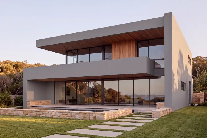
Basalt grey
A solid mid grey all over. Strong, but softer than charcoal.
- Walls Colorbond Basalt
Dulux, most popular exterior colours
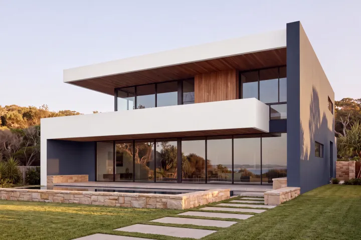
Navy and white
Two navy walls give a light house weight and a clear shape.
- Walls Dulux Pacific Line
- Trim Dulux Vivid White
Amity Dry's Hamptons palette, James Hardie
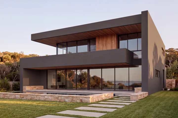
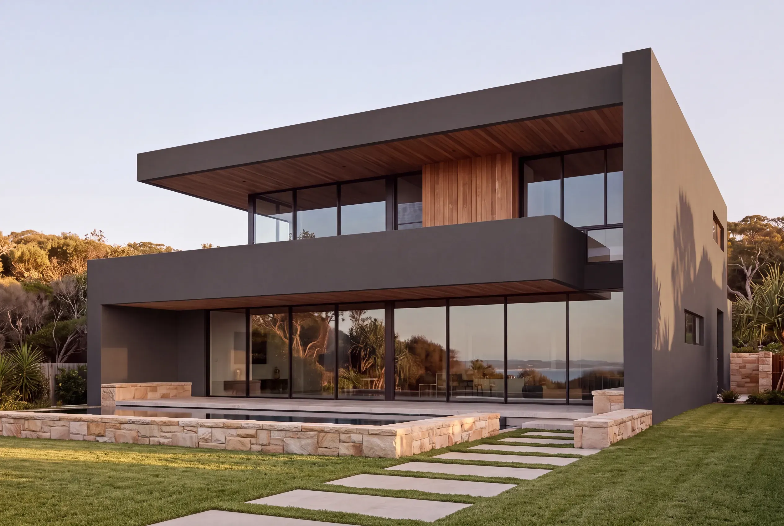
Dark
Near-black all over. The timber, stone and glass become the features.
- Walls Dulux Black Caviar
Dulux, Statement Status scheme
The darker schemes need a check before they go on some walls, which is covered further down.
Seen side by side, it is clear how much a house changes when nothing but the colour does. The same comparison for your own house is what makes the decision easy, and it is the one thing a paint chip cannot show you.
Why colour looks different on the house
A colour on a chip, on a sample card and across a house outdoors can look like three different colours. A few things are responsible:
- Size. Spread across a whole wall, a colour tends to look lighter and stronger than it does on a small chip.
- Sunlight. Colours read markedly lighter in full sun, about 30 per cent in the words of Wattyl colour consultant Katherine Champion, quoted by James Hardie.
- Direction. North and west walls take the strongest sun, while a south wall may sit in shade all day, so one colour can look like two on the same house.
- Surroundings. The roof, the garden, the sky and the neighbours all shift how a colour reads.
That is why painters often suggest going a shade deeper than the chip you first like, and why testing on the house matters more than anything in the shop.
Check before you go dark
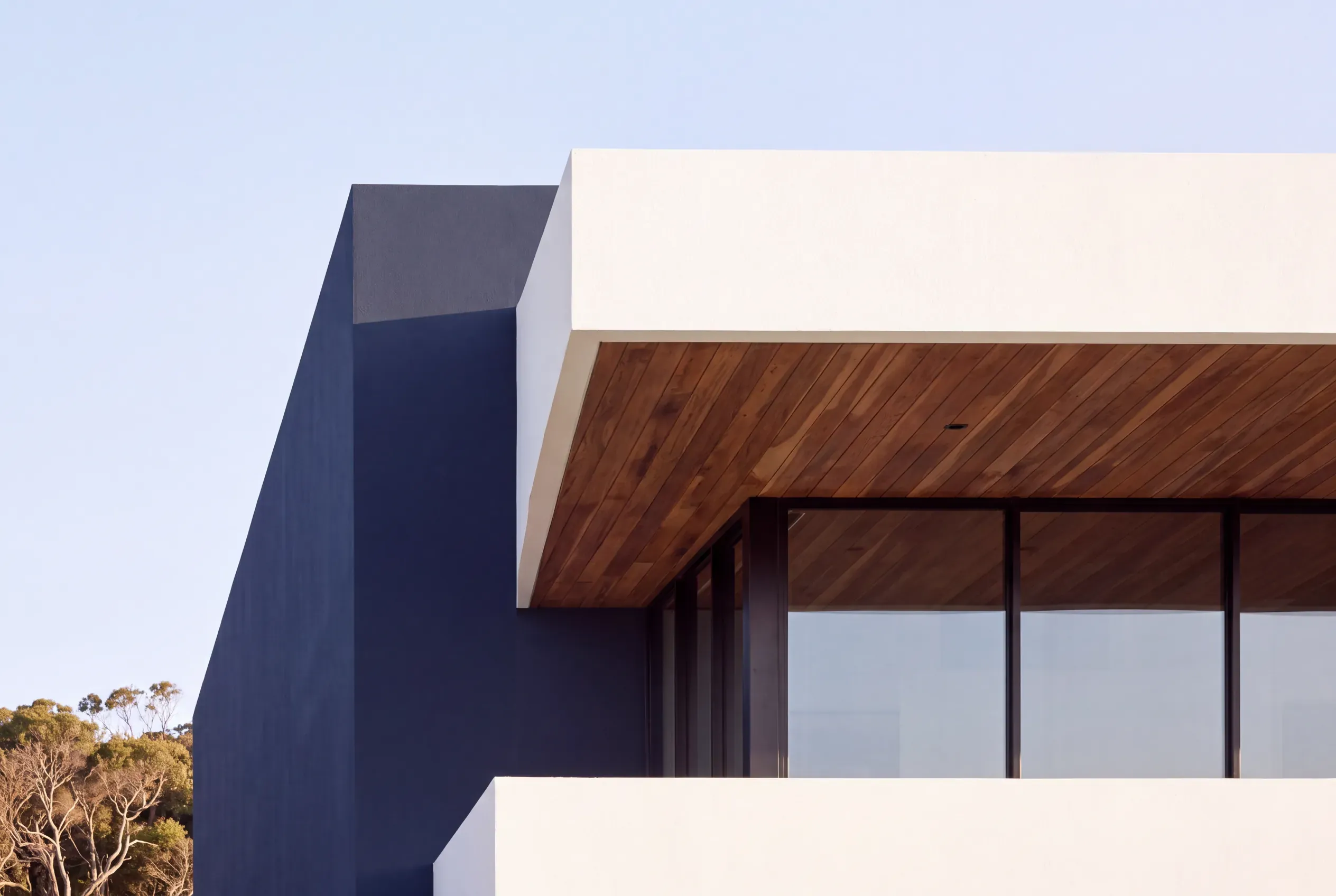
Dark walls look striking, and they also get hot. A dark colour absorbs far more of the sun’s heat than a light one, and that heat goes into whatever the paint is on.
On some walls that is not a problem. On others, the maker of the cladding or render sets a limit on how dark a colour can go, and a colour past that limit can void the warranty. Woodhouse, for example, says colours that are too dark on its pre-primed timber weatherboards cause cracking, warping and resin bleeding, and void its warranty. Render makers such as Rockcote set similar limits for render over lightweight backings like foam board and fibre cement sheet.
These limits are written against a number called LRV, or light reflectance value, which runs from 0 for black to 100 for white. You do not need to learn the scale. Your painter can check the number for any colour you are considering.
Some paints also come in heat-reflective versions that stay cooler in the sun than a standard paint in the same colour, such as Dulux Weathershield ColourGuard, which can help when a favourite colour sits close to a limit.
Check whether anyone else gets a say
A scheme can suit the house perfectly and still need someone else’s agreement. Three places to check before you buy sample pots:
- Estate covenants. Newer estates often have covenants that control building colours and roof types. Ask the developer or estate for the covenant and read the colour clause.
- Strata and body corporate. Townhouses, duplexes and units usually need approval for any exterior change. Ask for the by-laws and the approval process together.
- Heritage. Your council can confirm whether the property is listed or in an area with colour controls.
Test your shortlist on the house
Once the choice is down to two or three schemes, test them where they will actually live:
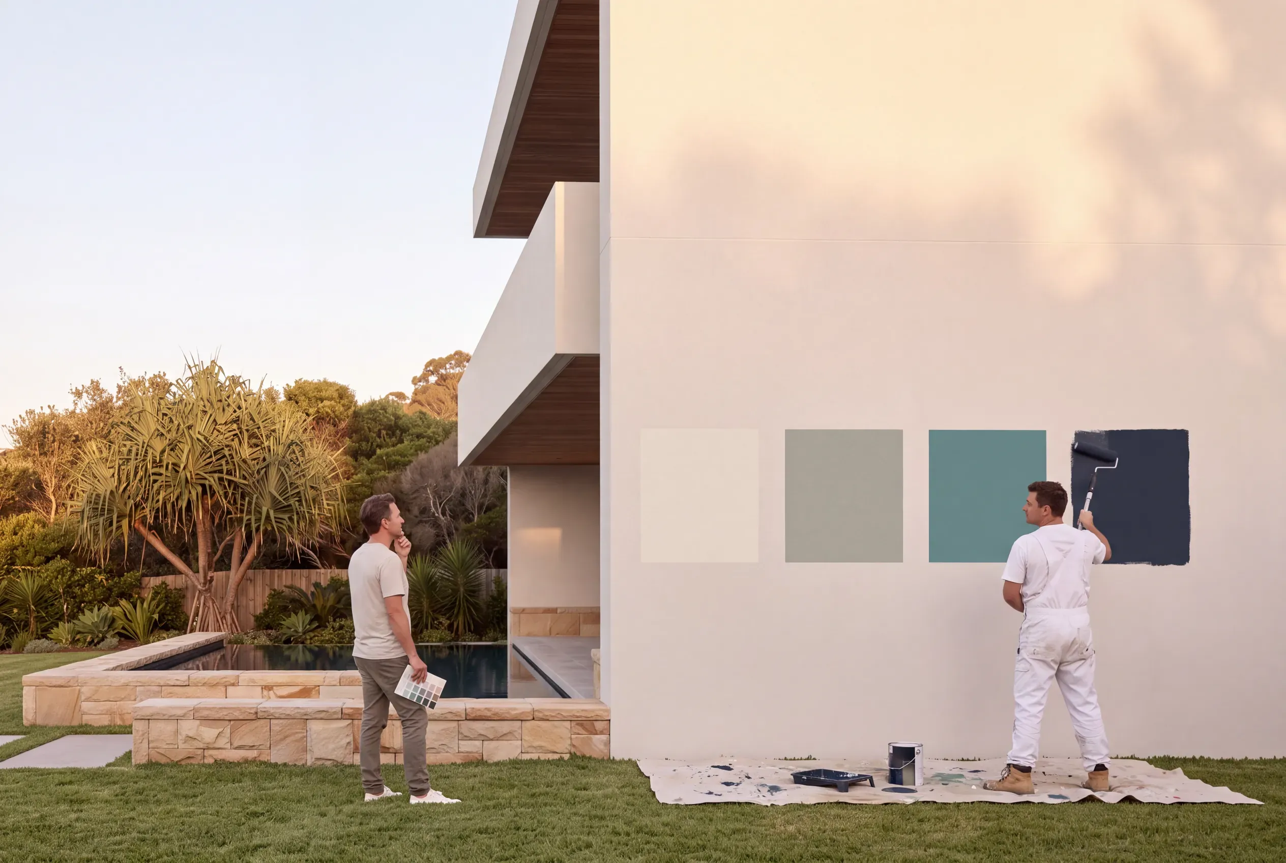
- Buy sample pots of each main colour. Paint large patches, at least the size of an A4 sheet and bigger if you can.
- Use two walls. One that takes strong sun, facing north or west, and one in shade.
- Paint beside what is staying. A patch that meets the roof edge, a window frame and any stone or timber tells you far more than one in the middle of a blank wall.
- Look at different times. Morning, midday and late afternoon, on a bright day and an overcast one.
- Step back to the street. That is where the house is mostly seen, at a distance, with the neighbours in the same view.
See the whole house before you paint it
A test patch answers one question well: what does this colour look like on this wall? What it cannot show is the whole house, with the new walls, trims, roof and front door working together, or two complete schemes side by side. That is usually the view that settles the decision, and it is the one most people are left to imagine.
Paint and roofing makers such as Dulux, British Paints and Colorbond offer online visualisers for trying colours on a sample house or a photo, and they are a good place to explore. When you want to see your own house, we create visualisations from a photo of it, the same way we made the schemes in this guide: your home, your roof, your windows and your garden, with only the colours changing, in each scheme you are weighing up. See how home visualisation works.
Frequently asked questions
How do I choose an exterior colour scheme for my house?
How many colours should a house exterior have?
What colour roof goes with white walls?
Why does paint look different on the house than on the colour chip?
Are dark exterior colours a bad idea?
Can you paint Colorbond cladding?
How big should a paint test patch be?
Can I see my house in different colours before painting?
Visualise your ideas before you commit
Save time, money and arguments. We turn ideas into images so you can confidently confirm and communicate your vision.
- 01
Send us a photo and
tell us what you are deciding. - 02
We build your options
from your photo. - 03
Get your renders
as PDF and digital files.
Your photo is used for your job only.
A local studio, not a platform.
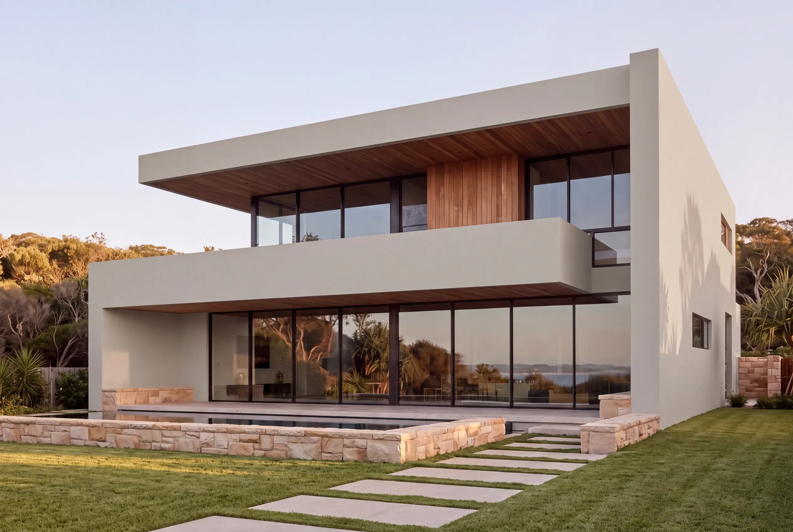
Only what you are deciding changes.